Using viewport height may not be the best option?
So i was making the website for GOOP-if you don't know, check out the post, or just go onto the website (still demo, it's on my github project page)
Anyways. And you know, I had to optimize the website for mobile devices as well. And one of the thoughts that I had, is to use viewport heights for each big container used, like this:
Anyways. And you know, I had to optimize the website for mobile devices as well. And one of the thoughts that I had, is to use viewport heights for each big container used, like this:

And so, the first 'white' background is the first container. right? and here's some code:
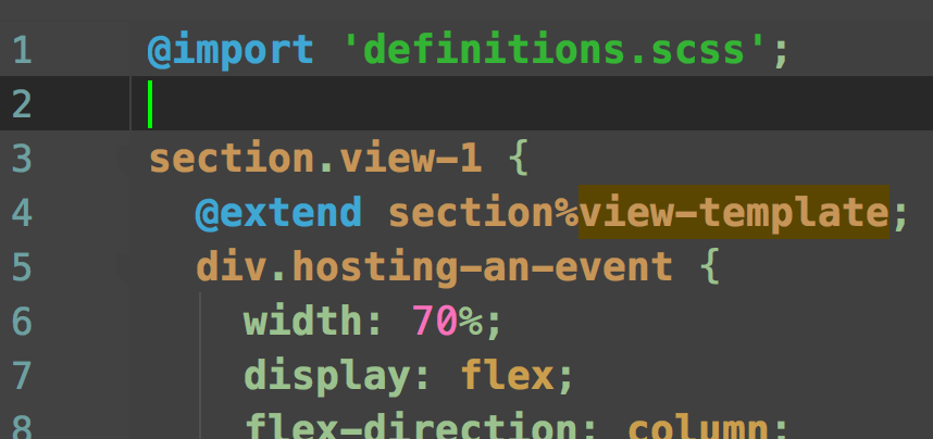
event.css
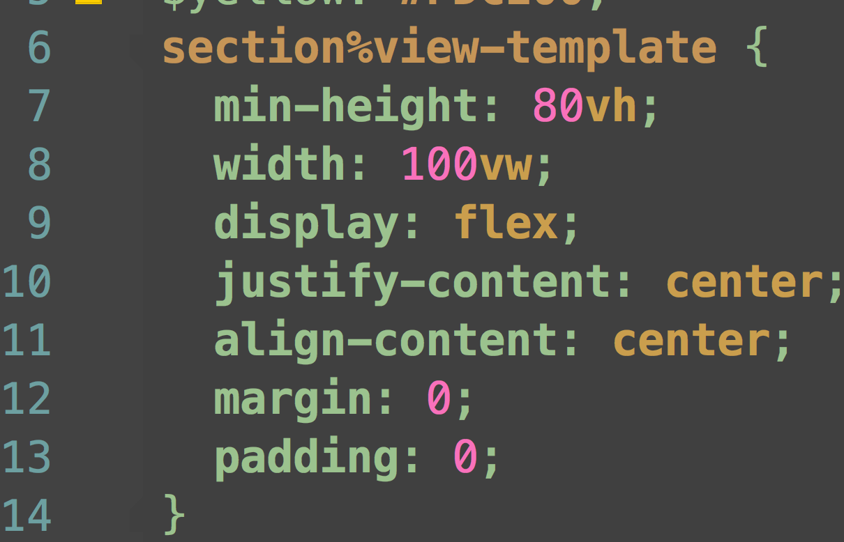
definitions.scss
So basically I set the min-height as 80 vh. There was no problem when I was testing the website on my chrome / safari. But suddenly when I opened it on my phone, the viewport height constantly changed (which I could know because the container kept resizing, so all the other containers would go down and come up and so on and so forth again and again.
So, to fix this issue (I actually applied 'vh' to all of the containers), I changed the setting to: height: auto; and set custom paddings/margins for inner elements. But for the first container, I could not change the height because it was intended to be bigger than how much elements inside of it occupied in terms of height. So I googled the problem and got an answer:
http://stackoverflow.com/questions/37112218/css3-100vh-not-constant-in-mobile-browser
not surprisingly, many people had this kind of problem, and to make the answer short,
this kind of problem was 'intended' to avoid bigger problems (...)
So yeah. I just got all the viewport heights removed and set the heights as auto, except the first container.
