1. Before starting anything else: how it all started
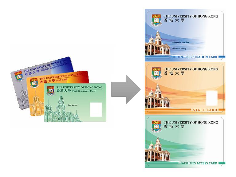
Ok. Uh...... Oh my god. are you kidding me? HKU ITS office announced that they are bringing changes to student card design. To quote some, "The new University Smart Cards are having a new look as well as improvement in both the printing and lamination quality for enhancing the durability of the cards." Alright. But they still look..... bad? I mean, ok. +1 for getting rid of that weird emboss effect. But why?? why is it still so... bad? I mean, who would want this? like, seriously. we are one of the... top.. what. let's say, 50 universities around the world. And exchange students from prestigious universities from the other side of the world are coming to our school to study, and also, students from oversees (mainly from Asia, but the point is, this kind of university where many races and peoples come is still rare in Asia) enrol as full-time students. And the more the university gets known and prestigious and so on (just all the positive adjectives that you could say here), the more the design identity of the school gets important.
2. Some more 'why' questions
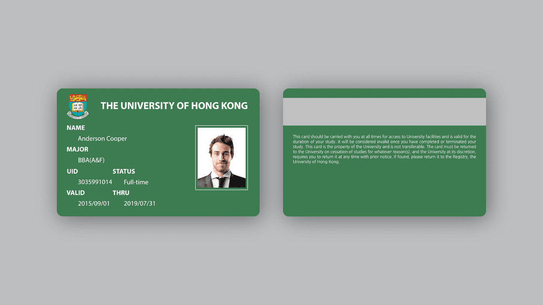
Why bother making one? Why do this? What will be better if HKU adopts a new student card design?: HKU's current student card design is not... good. Yes. not good. It's just not good. You don't necessarily have to have knowledge on design--when you see it, you know it's not good. Ah, actually, just read through and you will know what I mean.
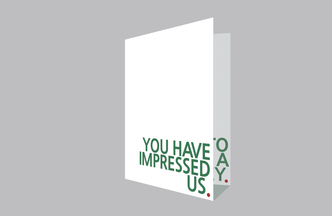
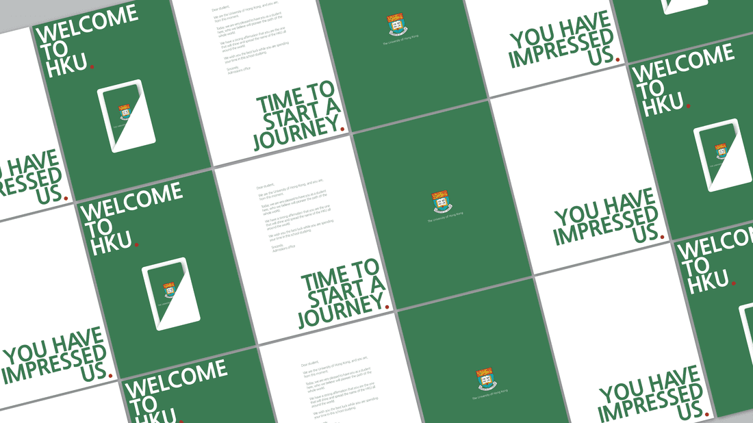
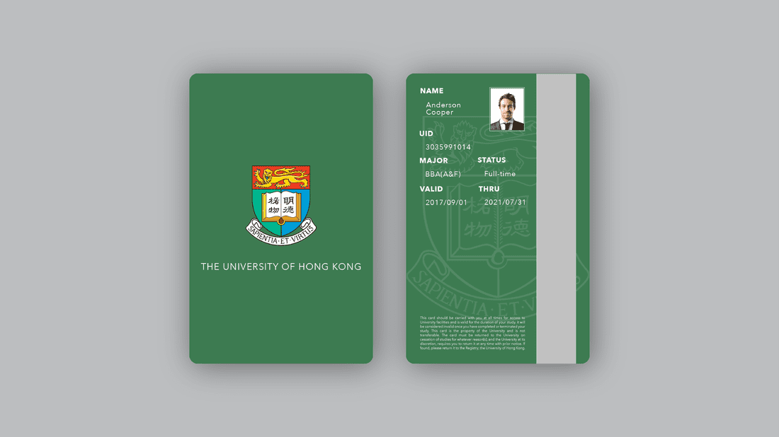
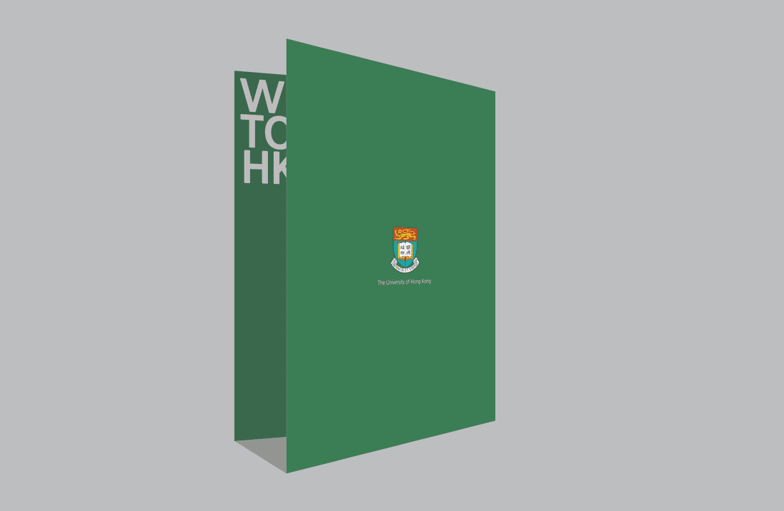
Why choose darker green (#3d7b51), white (#FFFFFF), darker red(#b12025)?: I mainly picked up colors from HKU's publications and HKU Logo. And what I primarily saw was the colors used for publication materials for graduation, which included 'darker green' as a principal color. Green also gives a sense of cleanness and professionalism, along with the thick, straight font used together. As for white, two reasons. (1) Practical reason. It'd be better (save inks, perhaps) to leave the paper as white so that no additional printing is required on the paper for the background color. (2) Emphasis + whitespace. As you can see, the card is placed right at the centre of the welcoming package. And only that portion is colored white, which clearly separates itself from the plain green background. It draws attention of whoever receives the package. It's probably the first thing they get to see once they get to open the package, since it's able to draw attentions. And leaving a lot of whitespace (ex. on the page "you have impressed us"), also gives attention to the rest of the content of the page that has a content. It also fortifies the minimalistic nature of the whole welcoming package. On the other hand, white fonts used on a green background will produce a good contrast, drawing attention to themselves. Darker red is like additive color to the overall design, yet still crucial. Without little red periods following each sentence, the sentence would feel less complete and decisive. Welcoming package- it is the thing they get when students meet up with the reality that they are entering the university they desired to get in. HKU needs to depict their clear decision to accept students and also that, they are not making a wrong decision, but an optimistic, warm one.
Why minimalism?:
1. Minimalism has been a trend that users (students) have become familiar with these days. It's become one of the biggest website design, and also app designs trends.
2. Minimalism brings a sense of professionalism and cleanness, and readiness, and this is what you want from your (perhaps & hopefully) dream university. You know what I mean here?
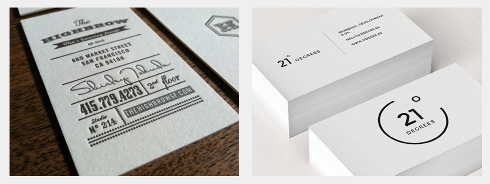
both designs are fine. I'm not saying either one is worse. But you see, it (making hku card minimalist) is more appropriate for the context. You see, both business cards look ok, but what do you naturally think of when you just look at them? For me, left = bakery or cafe or similar kind, but right = more of some kind of serious business.
So. If you do minimalism on hku student card, it'd seem more professional / serious / grave (not the #1 meaning in your dictionary. #2 one.) / pursuing study seriously / and even clean. And by looking at the student card, some people may even judge the school! We have to give the impression through the student card that our school (hku) is good as well. You know, when you get a gold starbucks card, you think it's good. why? the design looks clean and nice! (and therefore starbucks is cool. at least, if you are not from Italy or something, sitting in Starbucks and drinking a cup of coffee with a laptop on, pretending to do some serious business but in fact you are on FB, but whatever--looks cool. Doesn't it?) if it didn't, you wouldn't take a pic of your fresh golden starbucks card and upload it onto instagram. Would you?
Ok. I think that analogy... was not good enough. Let me give another one. Think of it as like a prestige / VIP card for an airline. And ofc, The design--it would not be creepy. right? it's for the people who pay millions of dollars for that. It's the same thing here. It creates a sense of being a prestigious member of a prestigious school! (if you don't agree even the changed design won't do--at least more than the one that the school has for now)
3. Here goes the design finally.
Made with:
- Illustrator
- Photoshop
DESIGN A
Why Design A?
Why Design A?
- I tried on making a very standard design of a student card.
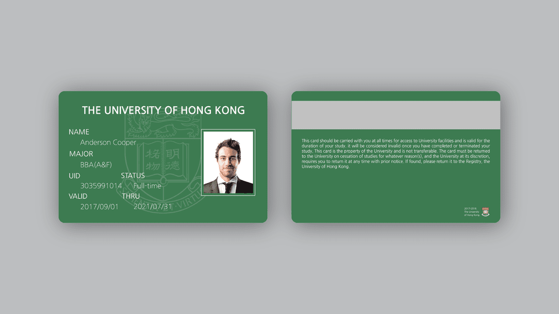
DESIGN B
DESIGN C
Inside the package
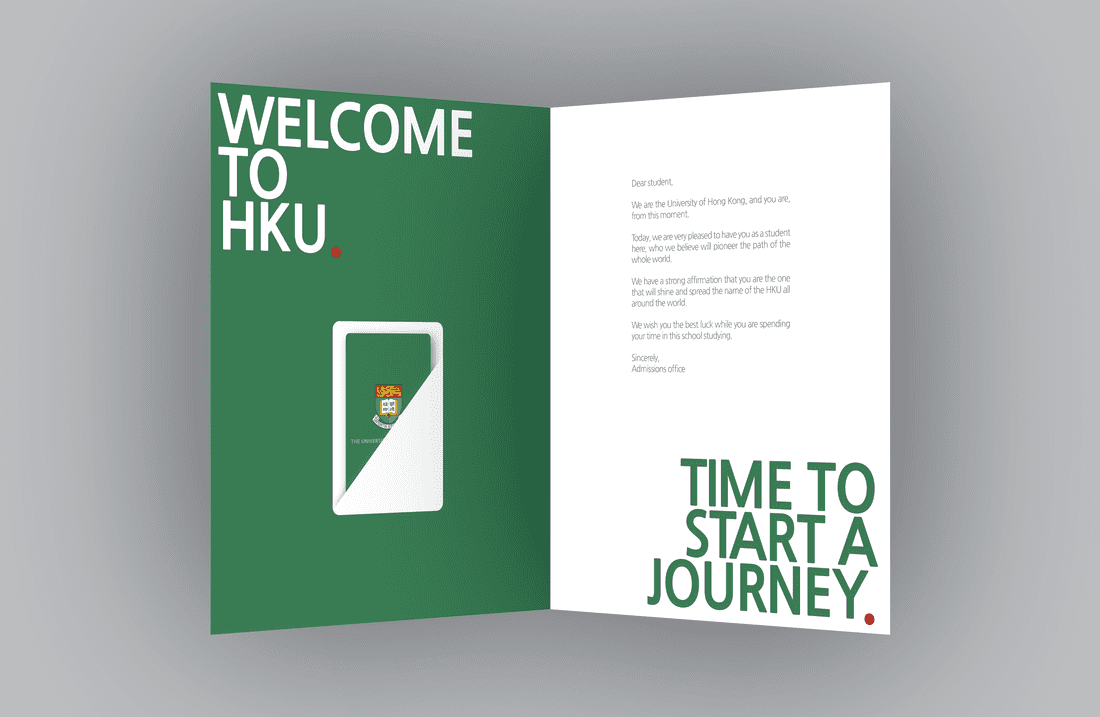
2nd & 4th page
1st & 3rd page