2. Typography
Reminder: go to sources (bottom). most things, which I thought were succinct enough-i just copied them directly into my paragraphs.
1. Types of fonts?
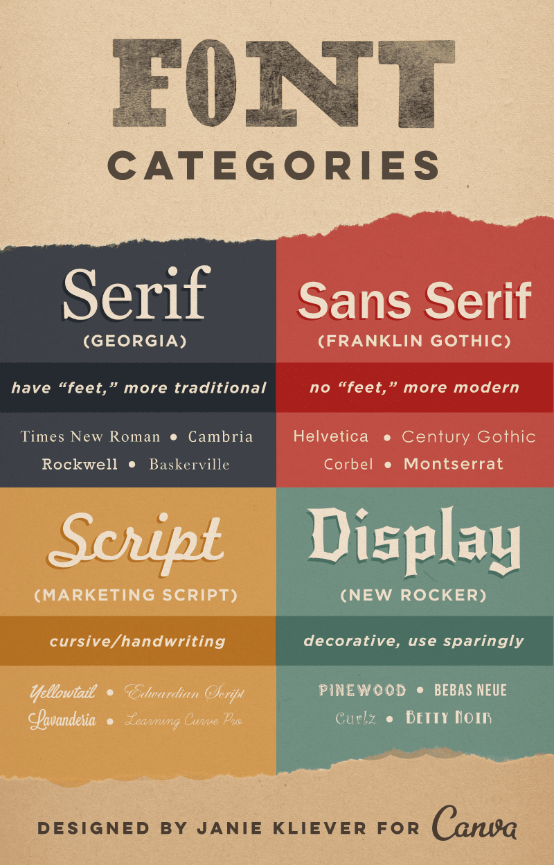
- Serif
- A serif font will have a small line attached to the end of the letter stroke
- These fonts have thin/thin transition strokes
- These fonts are usually very easy to read
- Common Uses for Serif fonts: Used most often in printed materials because of the readability. The human eye can recognize the shape faster with serifs.
- Example Font: Times Roman
- Sans Serif
- Sans serif fonts are composed of simple lines and have little or no thick/thin transition strokes at all
- These fonts have no serifs
- Common Uses for Sans Serif fonts: Used most often in web materials. The lower resolution of computer screens make it difficult to see serifs. So, a sans serif font will display cleaner. Sans Serif fonts are often used in headings and captions in printed materials.
- Example font: Helvetica
- Script
- A script font appears to be hand written
- These fonts are usually used to add style
- Character strokes may connect one letter to the next
- Example font: Bradley Hand
- Decorative
- Decorative fonts are rarely used for blocks of text
- These fonts often include symbols or flairs that convey specific information or emotions
- Example font: Outlaw
- Important definition: typeface + style + size = font. A font is what you use; a typeface is what you see.
To make the explanation clear, I just collected some of the examples from Google Fonts (did some search and copy & paste), and another amazing elaboration from Canva team:
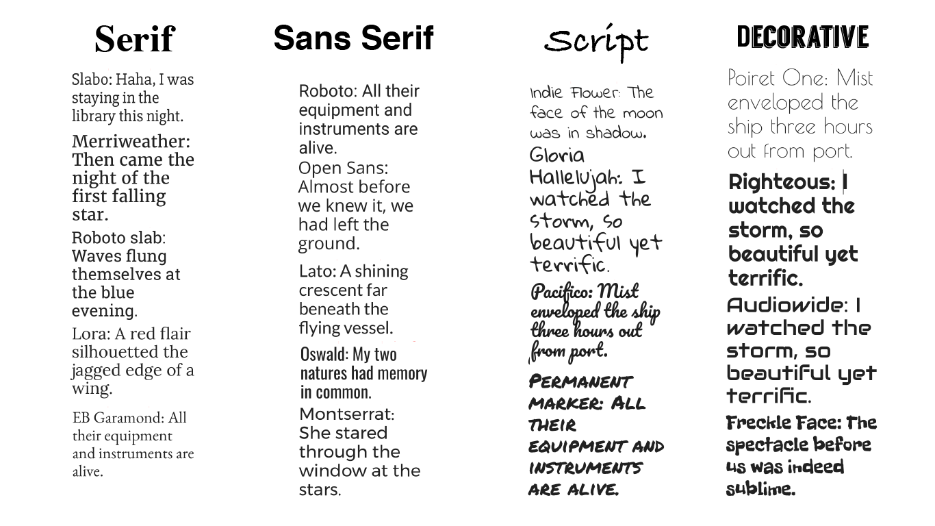
Comparison between different font types
2. Which one to go with?
Context & Audience.
- Who are they that you are trying to target with the design? Why are you designing it and what's your aim? What impressions / messages do you want to communicate to the audience? My font should be able to answer such questions. The font should be coherent with the context and the audience.
- Fonts must be easy to read. You know where the boundaries are. Here are some guidelines:
- Size: Does your font work on small screens, as well as big screens? And does the font itself also get smaller and bigger without any problems?
- Spacing (X and Y): Adjust the space between letters to enhance readability.
- X-height: "The height of a font’s lowercase letters. A generous x-height in proportion to the typeface’s capital letters improves readability and maintains it at smaller sizes. However, you don’t want the x-height to approach so close to the capital letters that it’s hard to distinguish between the two cases."
- The I/l/1 test (Capital I, Lowercase L, and number 1): If two or more look identical, then readers might stumble over certain words or letter/number combinations.
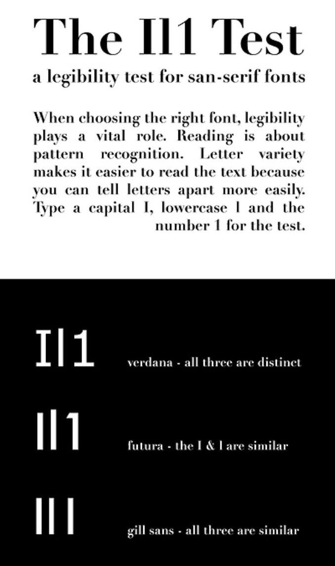
The I/l/1 Test
Copy length
- Not a consideration for web, usually. But for books and newspapers, you are likely to have more characters and readers may be distracted sometimes from reading them just because they are too long.
- Consider the advantages and disadvantages of Serif and Sans Serif, and also how the chosen font may be applied in the medium used (website, book, newspaper...). "Body typefaces are used in body copy: book text, magazine or newspaper text, website content, any lengthy passages. These fonts are easy on the eyes and easy to read. It’s important that they’re not distracting, so users can easily skim or scan the text. This is the category that fonts like Times New Roman and Arial fall into.". "Display or decorative typefaces (briefly mentioned at the beginning of the article), on the other hand, are never suitable for reading at length. These are the type of fonts that scream, 'Look at me!'"
- Sometimes you need to bolden, italicise, or do more things to your text. Check if your font's capable of doing that.
Sources (thanks very much):
- http://www.fusionforward.com/6-common-font-categories/
- https://www.fonts.com/content/learning/fontology/level-1/type-anatomy/type-classifications
- https://www.fonts.com/content/learning/fontology/level-2/making-type-choices/selecting-type-for-text-factors-to-consider
- https://designschool.canva.com/font-design/
- https://www.smashingmagazine.com/2010/12/what-font-should-i-use-five-principles-for-choosing-and-using-typefaces/
