4. Finding the color palette and font.
alright. so from the previous posts, I know things now.
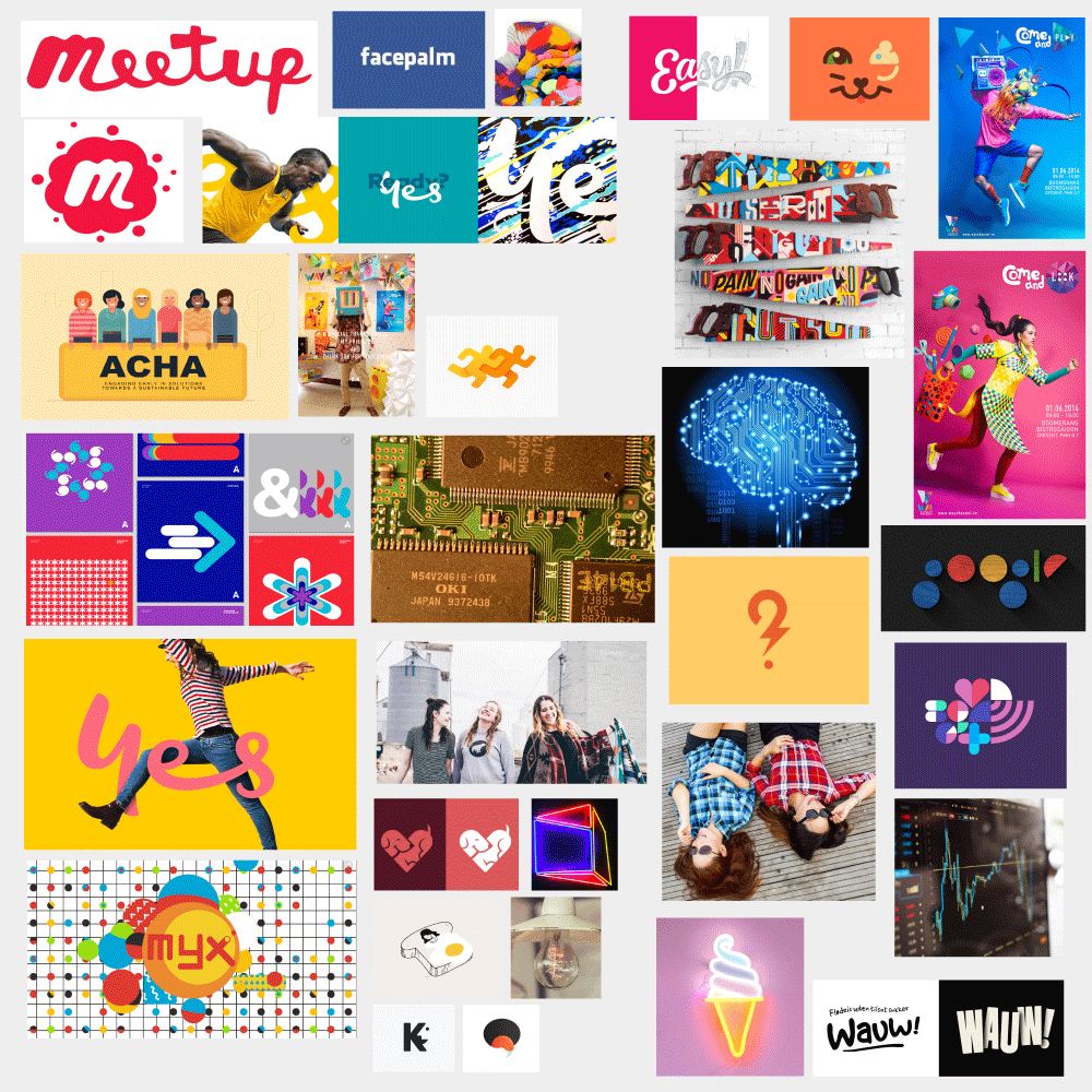
Ok. just to review, here's the mood board from the last post:
1. Color
and here're all the color palettes that I just find good. Oh. Yeah. Before that, let us just review what impressions/meaningseach color would possibly generate from the post on colors (may be too broad, tho):
- Red: Passionate, Aggressive, Important, Love, Anger, Danger, Warm, Gravity, Desire, Strength
- Orange: Playful, Energetic, Cheap, Agressive (but less than Red), Happy, Vibrance, Young, Joy,
- Yellow: Laughter, Happy, Friendly, Warning, Overwhelming if used too much, Cheers, Childish
- Green: Health, Wealth, Growth, Stable, Prosperous, Nature, Healing, Possibility, Safety, Refreshment, Harmony, Rest, Peace, Money
- Blue: Serene, Trustworthy, Trust, Security, Inviting, Professional, Depressing, Intelligence, Relaxing, Friendly, Clean, Seriousness, Logical, Cool.
- Purple: Royalty, Power, Luxury, Nobility, Wisdom, Magic
- Black: Power, Elegance, Formality, Death, Evil, Mystery, Glamour, Security.
- White: Light, Goodness, Innocence, Purity, Virginity, Hygiene, Sterility, Clarity, Purity, Cleanness, Simplicity, Sophistication, Efficiency.
And.. we know what we wanna see from our 'brand' are:
- Fun
- Easy
- Smart
- (+Social, Friends, Bright, Friendly, Active, Young..., but not that important. above three are the most important.)
And so here're (finally) some color palettes:
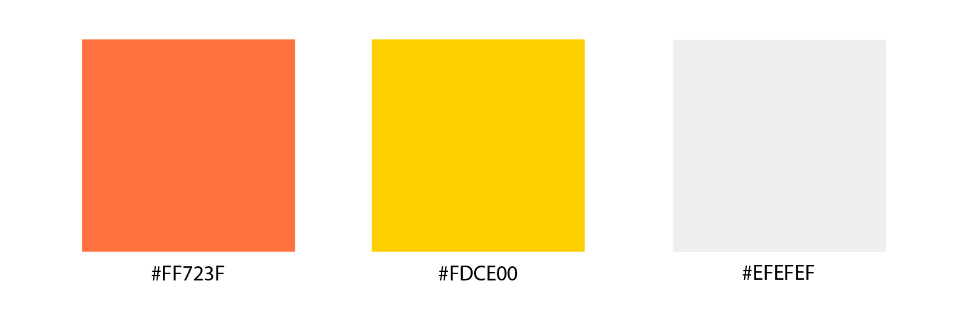
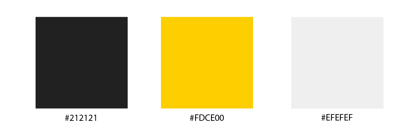
Why these colors? Brings a sense of being 'friendly, fun, easy'. Not so many, but not too few. Yellow and Cherry give enough warmth/friendliness, but not too much, so that it may invoke a sense of fun as well. White, of course, it's not #FFFFFF, it's too dramatic. Instead, it's #EFEFEF, enough to make a nice little contrast between cherry and/or yellow. As Jeff said, just because of this white color, the overall design would not become 'cold'. Alright, then. But have I not thought about other color combinations?
I was actually tempted to use some of these color combinations:
I was actually tempted to use some of these color combinations:
First off, I could not just change yellow and white to other colors, since these colors would be a good fit for what we are aiming for (friendly, easy, fun ...), and it seemed that the problem lies on the 'primary' (first) color that should interact very well with the rest two.
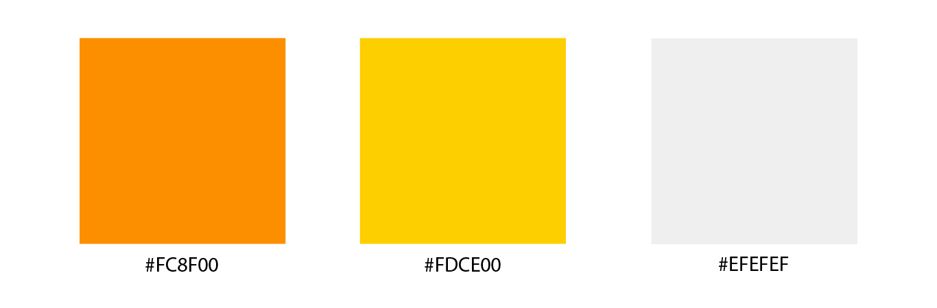
This one, as you are going to see in a moment (probably in the next article) + as I discussed with Jeff, that 'cherry-like' color (#FF723F) could be more practical than this 'orange' color. Orange on yellow would and orange on white would give a less contrast than 'Cherry-like' on yellow and on white. And indeed, this orange color may seem too playful, especially compared to that cherry-like color. So pass this one.
This one, as you are going to see in a moment (probably in the next article) + as I discussed with Jeff, that 'cherry-like' color (#FF723F) could be more practical than this 'orange' color. Orange on yellow would and orange on white would give a less contrast than 'Cherry-like' on yellow and on white. And indeed, this orange color may seem too playful, especially compared to that cherry-like color. So pass this one.
This one may seem dramatic. I know. Why this sudden black? Well. It could have some kind of a bigger impact and clear afterimage for users. Black + yellow, and black + white would make a huge contrast, so that the logo may stand out. But it's too dramatic that it may pose some important problems:
- Too strong
- Too sporty(?)
- Too active
- Too Spotify-like party vibe (if you get what I mean.)
So finally, I had to choose the first color palette. I(We-right, Jeff?) think it's not bad!
2. What about the font.
Let's go back to the thing and check out what we need in order to decide which font to use.
Context & Audience: well, we said we want 'fun, easy, friendly, smart ...'. So definitely it's not decorative or Serif. It'd be either Sans serif or Script for the logo. Yeah. But the 'fun, friendly' part attracts me to script more than Sans. We could go Sans for the website and general wordings, but for the logo, which is representative of our business-should signify "what our business might be about". Depending on the script font, we could also, I think, distort (twist) the words a little bit, so that we could make it look a bit more 'funny/friendly'. The audiences are the people who would use Facebook messenger, have look at the extensions and our logo, and would think what our business might be about. And at that moment, the fonts in the logo should be able to convey the desired meaning. In that sense, even though this is a bit of digression from talking about fonts, the logo should - as I discussed with Jeff - be able to signify our business could be something about 'communication'.
Legibility & Medium used: GOOP. it's only four letters. And mainly, we are going to use them in an electronic setting. So I see no special problems here.
Licence: it'd be great if we find a commercial licence font (means we could use them for commercial purposes, like making a logo / using them for making a T-shirt, whatnot)
After some searching, I was able to come up with this font: Ludicrous.
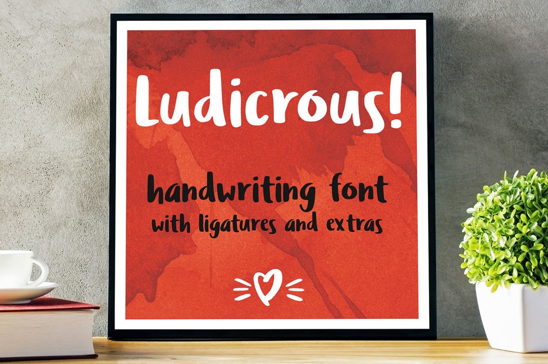
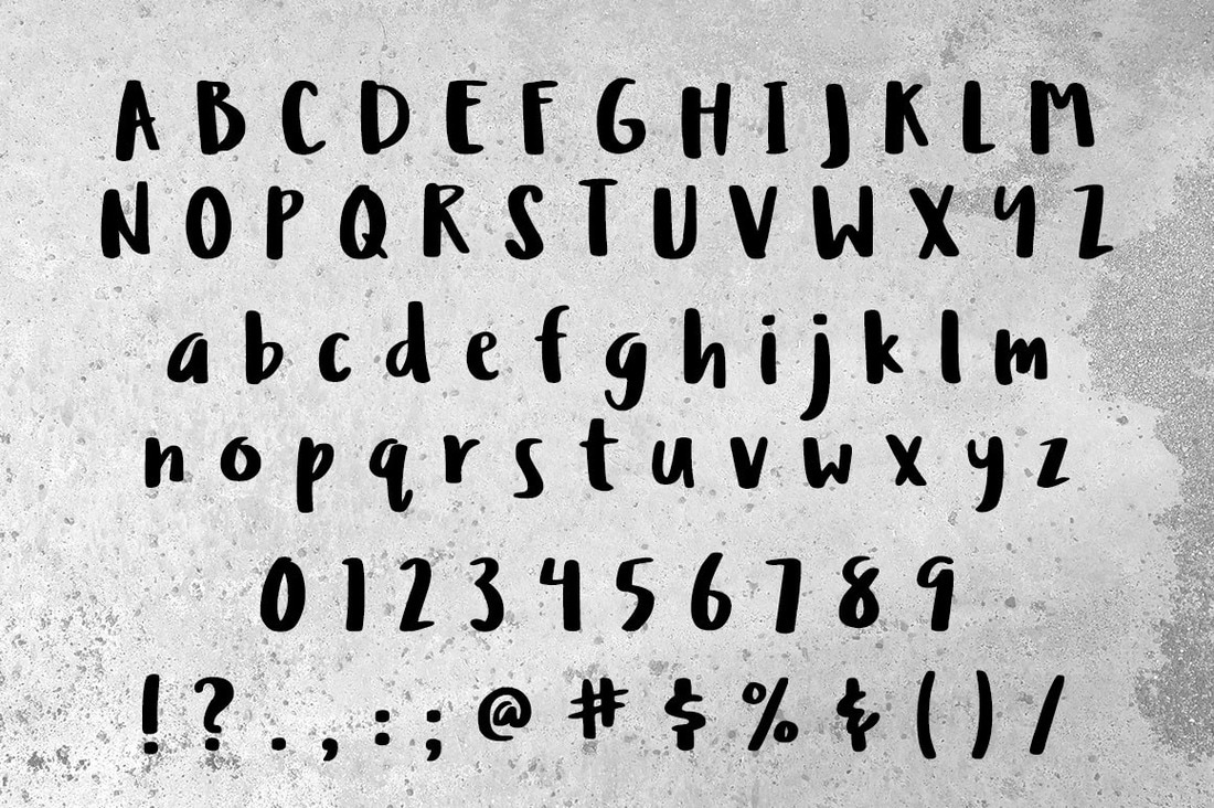
it's free, it's could be used for commercial purposes, it's quite legible, but it also suits the impressions that we want to give, but at the same time it's not too creepy. Thank you Missy Meyer so much! Here's I/l/1 test that I did on my own for your information:
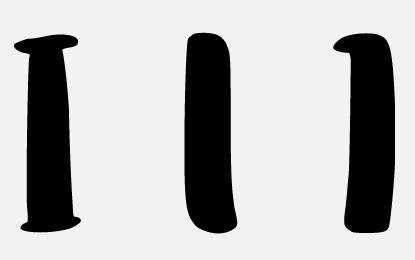
Well, yeah. I mean, we can distinguish them. It's not super clear, but it's clear. And also, this font is likely to be used only for logo purposes, so it's going to be alright.
Cool. As long as we are not encountering any problems with this font, this font is good for now (Jeff loves the font)
2.5 Web font?
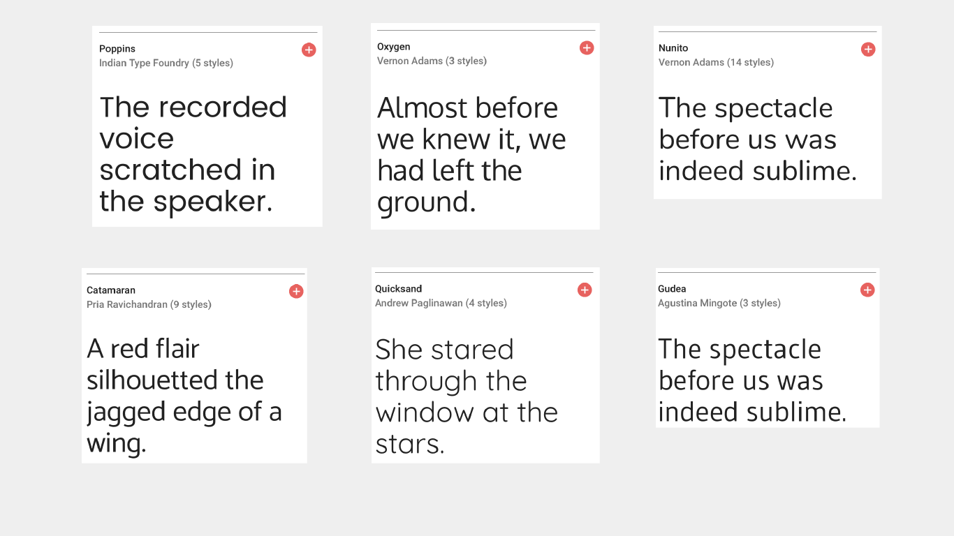
We had a look at several sans serif fonts on Google fonts:
- Poppins
- Oxygen
- Nunito
- Catamaran
- Quicksand
- Gudea